brief
When I joined the RTD team, the design agency had never defined a set of brand standards and was running on a mix of original legacy designs and random graphic elements.
pitch
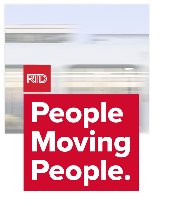
Our team elevated the RTD look and feel, creating a brand book for the first time in the agency’s history. We pushed
for clean modernism while managing to have some fun where it counts.
for clean modernism while managing to have some fun where it counts.
deliverables
Brand development //
Corporate design //
Layout and production //
Micro animation and motion graphics //
Photography and asset creation //
Corporate design //
Layout and production //
Micro animation and motion graphics //
Photography and asset creation //
Material is property of RTD Denver, used with permission.
This material must not be shared, saved, or posted
This material must not be shared, saved, or posted
brand wrangling
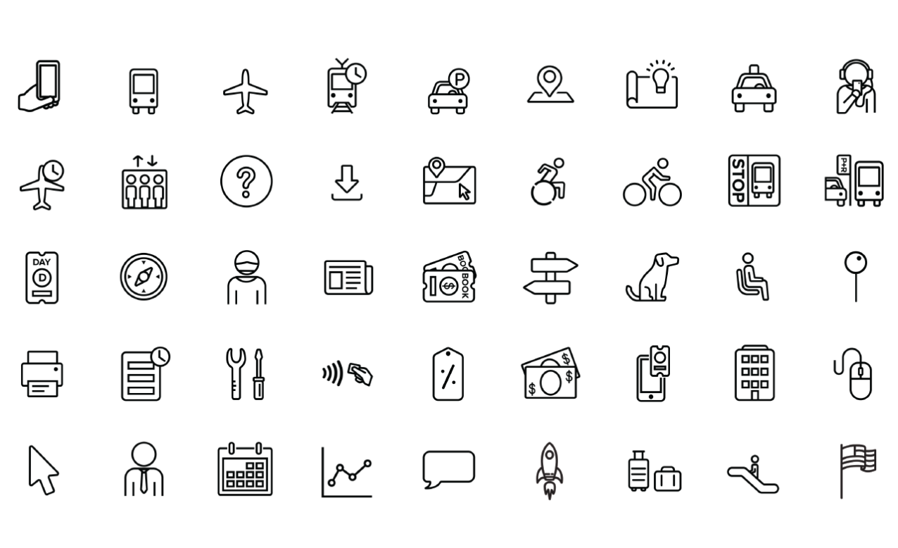
I was personally responsible for modernizing a number of brand elements. This included:
Creating an expandable library of icons to be used in our website, app, social media, and other communications. //
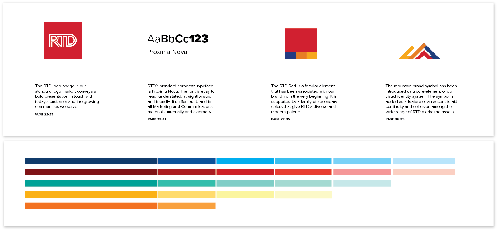
Revamping the official colour palette to include secondary shades and to improve some dated core colours. //
Redesigning our internal and public-facing documents to be more accessible and more in line with brand standards. //
Developing official RTD brand guidelines and helping to produce the first-ever brand book. //

refine
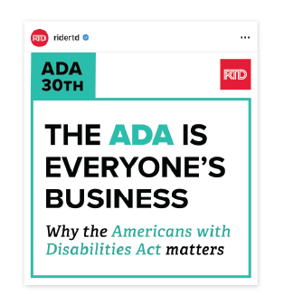
We began the modernization process by paring the brand back to its basic components, emphasizing clear and friendly communication, simple graphic elements and clean typography.
I built out the brand book with this trimmed-down standard, giving our communications and advertising teams a foundation of guidelines that they could built upon.
evolve
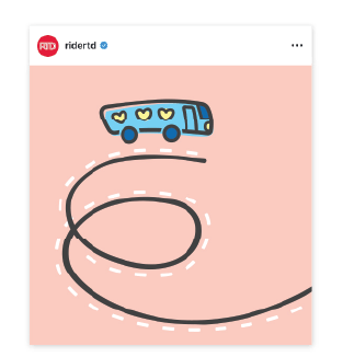
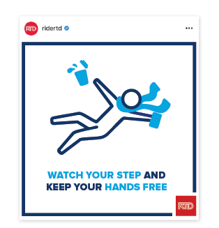
Once we established RTD’s standards, we could experiment with new ways of infusing the agency’s public-facing communications with playful creativity.
This evolution of our visual language focused on enhancing the new modernist standards with pops of illustration, photography, and animation to better engage our audience.